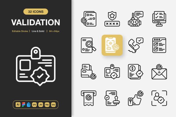
Validation Icons
Designers and product teams often underestimate how much quiet friction lives inside a single icon choice. A generic checkmark, a vague warning symbol, or an unclear status indicator can slow a transaction, confuse a new user, or weaken brand trust in a split second. Validation Icons address this gap directly. They are a curated set of high-quality, minimalist symbols built to confirm, alert, approve, or reject actions across digital and print environments. When implemented thoughtfully, these icons do more than decorate an interface—they reduce cognitive load, reinforce clarity, and subtly guide people toward confident decisions.
Why Visual Validation Is a Strategic Layer, Not Just Decoration
Most teams treat validation states as UI afterthoughts. A form error appears in red text. A success message pops up with a thumbs-up from a free icon pack. That approach works until it doesn’t. When a financial dashboard uses an unclear symbol to flag a compliance issue, or a health app’s “verified” badge feels inconsistent across screens, the user’s trust starts to fray. Validation Icons function as a visual language layer that sits between raw data and human understanding. They signal whether something is correct, pending, problematic, or complete—without forcing the user to read a paragraph every time.
Strategic teams use these icons to create a predictable emotional cadence. A well-placed approval icon lowers anxiety after a payment. A gentle warning icon before a deletion prevents costly mistakes. Over hundreds of interactions, that consistency builds what psychologists call “perceived control”—the user feels the system is reliable. That perception often determines whether someone returns or churns. So the decision to move beyond random clip art toward a dedicated, scalable set is less about aesthetics and more about operational reliability.
Aligning Validation Icons with Clear Communication Goals
Before dropping an icon onto a screen, ask: what specific mental state should this trigger? An ecommerce checkout might need a confirmation icon after an order, but a project management tool might use the same shape to mark a task complete. The meaning must hold steady across the entire experience. Validation Icons support this because they come in both line and solid styles, giving you the flexibility to assign weight and hierarchy. A solid “verified” badge carries more authority; a line “info” icon invites a lighter, more neutral reading. That distinction matters when you’re designing for a foreign language audience or for users with accessibility needs.
Bigger planning challenge: validation icons often sit near data that could change. A certificate icon next to a product might indicate “safety tested” today, but if the certification lapses, the icon must be removed or updated. Tying icon selection to a content governance process is smart. That way, the presence or absence of that symbol becomes a signal of real-world status, not just a static graphic. This turns your icon set into a lightweight monitoring tool for your own team.
When Minimalist Design Becomes a Performance Advantage
The set described here is deliberately minimal. That’s not a trend; it’s a practical advantage across varied media. A minimalist validation icon renders crisply on low-resolution trade show banners, remains legible at 16px in a mobile app tab bar, and survives the distortion that comes with high-speed print runs on uncoated paper. The high-quality SVG and PNG files included mean you can scale without degradation. For a small business owner producing a flyer today and a mobile app prototype tomorrow, not having to re-source or redraw symbols saves billable hours and reduces inconsistency.
Minimalism also copes better with responsive layouts. A detailed, shaded icon loses integrity when it shrinks. The editable stroke feature in the source files—Adobe Illustrator, Figma, and Iconjar formats are all provided—lets you thicken or thin the lines to match your brand’s visual weight. One client in education publishing found that slightly bolder validation icons improved readability for older learners on tablet screens, without requiring a full redesign. That kind of micro-adjustment is only possible when the base asset is built cleanly enough to modify quickly.
Planning Contexts Where Validation Icons Reduce Real-World Errors
Consider a healthcare booking portal. A patient fills out insurance information. Instead of a generic asterisk for required fields, a subtle error icon paired with a gentle “needs review” tooltip catches a typo before it cascades into a denied claim. This isn’t hypothetical. Downstream cost of a single data entry mistake in regulated industries can exceed the price of an entire design toolset. Validation Icons serve as a front-end safeguard. The same logic applies to legal document assembly tools, where a green “compliance met” icon versus a yellow “missing clause” icon prevents contracts from going out incomplete.
Planning tip: map out your user’s emotional arc and place validation icons at the points of highest anxiety. If your product asks for credit card information, the moment the number validates in real time, a subtle check icon can reduce cart abandonment. Don’t wait for the final submission. The drag-and-drop nature of these asset files (PNG transparency, SVG, JPG) means you can rapidly prototype such micro-interactions in Figma or directly in code without breaking momentum.
Avoiding the Trap of Over-Validation
One risk with having a rich library of validation symbols is the temptation to use too many. When every data point gets a badge, a star, and a checkmark, the screen becomes noisy and the icons lose meaning. The most effective use of Validation Icons is often sparse. A loan application dashboard might need only three: “document verified,” “action required,” and “under review.” Resist the urge to decorate. Instead, ask: will removing this icon increase ambiguity? If yes, keep it; if no, it’s clutter.
Another common mistake: using the same icon style for opposite meanings. A solid red X for “error” and an outline red X for “close” can confuse. With both line and solid styles at your disposal, dedicate one style to status communication and the other to UI chrome controls. This small taxonomy decision, documented in your design system, saves hours of debate and prevents embarrassing miscommunications that ripple through customer support tickets.
How 100% Customizability Serves Brand Consistency Over Time
The phrase “100 customizable” isn’t just a bullet point. It means every icon is built with editable strokes and shapes, so you can match your brand’s corner radius, stroke terminal style (rounded or butt caps), and even the precise hex value of your brand palette without rebuilding from scratch. Over the lifespan of a brand, logos and colors evolve. A validation icon set tied to a static, uneditable format would need replacement. With source files in AI, EPS version 10, and Figma, you future-proof that investment. A marketing director at a midsize SaaS company told me they’ve carried the same icon library through three brand refreshes, simply updating stroke weight and tint each time. That continuity speeds up rollout and preserves user familiarity.
Also note the inclusion of an Iconjar file. For teams that manage large UI projects, Iconjar acts as a central searchable repository. When a new hire joins and needs a specific warning symbol, they can search by keyword rather than digging through folders. This reduces time-to-launch for campaigns and feature updates. It’s a small operational detail that compounds in value.
Connecting Validation Icons to Long-Term Learning and Onboarding
Onboarding flows often rely heavily on text-heavy tooltips. Replacing some of that text with universally understood validation cues can accelerate comprehension. A self-serve analytics platform, for instance, might use a green checkmark to indicate that a data source connection succeeded. A solid “sync” icon with a subtle pulse could show real-time status. Users learn these patterns within minutes, not through training modules, but through repeated exposure. Once internalized, the icons reduce the perceived complexity of the software, making advanced features feel accessible to non-technical decision-makers.
For educational publishers and course creators, these icons can structure learning progress. A “completed” icon, a “needs revision” icon, and a “certificate awarded” icon create a visual transcript. When learners glance at a dashboard and see a series of completed badges, they’re subtly reinforced in their momentum. That positive feedback loop encourages completion rates more than any motivational pop-up. But the design must be neutral enough to avoid feeling childish; the minimalist line style handles that balance well.
Operational Considerations for Print, Flyers, and Physical Media
Digital-first designers sometimes forget that validation icons also live on event badges, restaurant menus (allergen confirmed, vegan certified, etc.), product packaging, and safety signage. The high-resolution JPG, EPS, and PNG with transparency included in this set transfer directly into InDesign, Canva, or even large-format printers’ RIP software. The editable stroke ensures that when you need a version for screen-printed merchandise—where thin lines might close up—you can bulk up the stroke without losing the shape’s character.
A local bakery chain, for example, used the solid-style “approved” icon on their ingredient sourcing poster to indicate third-party organic certification. They later adapted the same icon set for their mobile ordering app. The visual consistency between the in-store signage and the digital experience made the brand feel more trustworthy and unified, without hiring separate illustrators for each medium. That’s the quiet power of a versatile, ready-to-drag-and-drop icon library: it collapses the gap between physical and digital brand touchpoints.
When to Invest Effort in Customizing Validation Icons vs. Using Defaults
Not every project demands deep customization. A rapid prototype or an internal tool can use the icons out of the box, and the clean defaults will serve well. But customer-facing products, especially those in competitive markets where trust is a differentiator, benefit from fine-tuning. Changing the stroke color to match your error palette (not just standard red but a brand-appropriate coral) can feel more considerate. Adjusting the scale to ensure optical balance with your typeface demonstrates attention to craft that users may not articulate but will sense.
One useful exercise: take three core validation states (success, warning, error) and place them next to your primary CTA button. Do they feel like a cohesive team? If the error icon’s line weight is too thin compared to the button’s border, it gets visually lost during moments of heightened anxiety. With the source files provided—ESP, SVG, AI, Figma—you can tweak these nuances in minutes. That immediate feedback loop encourages more deliberate decision-making rather than settling for “good enough.”
Why File Format Variety Matters for Cross-Functional Teams
Different roles access design assets differently. A freelance web developer might drop the SVG directly into code. A marketing coordinator assembles a social media graphic in Canva and needs a transparent PNG. A book designer laying out a guide needs an EPS for precise print color management. A UI designer prototyping in Figma wants the component library at hand. And a technical illustrator might need the original AI or EPS Version 10 to integrate into complex diagrams. When all these formats are bundled—along with a simple Readme.txt that explains naming conventions and usage rights—the validation icon set becomes a shared resource rather than a siloed design file. That reduces bottlenecks: no more “Can you export this in another format?” emails. The team moves faster, and the final product reaches the audience sooner.
Making Intentional Choices That Compound Over Projects
Think of Validation Icons not as a one-time purchase but as a lightweight design system for clarity. Over a year, a freelancer might use the same symbols on a SaaS product, a nonprofit annual report, an event flyer, and a social media infographic. Each time, the icons behave predictably. This predictability trains the freelancer’s own eye for consistency, making their portfolio feel more mature. For small business owners, it reduces the temptation to mix and match incompatible icon styles from multiple sources, which often leads to a chaotic visual brand.
The most undervalued feature might be the ease of drag and drop. When an asset is frictionless to install, teams actually use it. Many robust icon sets sit unused because the workflow to extract and optimize them is painful. But when PNGs are already transparent, SVGs are clean, and source files are organized, adoption soars. You’re more likely to experiment with a new warning pattern in a prototype if it takes 30 seconds instead of 20 minutes to prepare the asset. That experimentation leads to discoveries about what your users truly respond to.
Aligning Validation Symbols with Long-Term Customer Experience Goals
Customer experience isn’t just about polite support emails; it’s about whether the product consistently meets expectations. A validation icon that appears after a successful password reset confirms that the system worked. Its absence in a buggy flow signals neglect. By standardizing on a high-quality set, you create a silent contract with the user: “We’ll always confirm when something important happens.” This goes for financial approvals, health test results, document verifications, and even social proof badges. The consistency builds a reputation for reliability that marketing campaigns alone cannot fabricate.
For those who publish infographics or educational content, using recognizable validation cues helps readers quickly assess credibility of statistics or claims. A “fact-checked” icon next to a data point, derived from the same icon family, visually separates vetted information from opinion. Over time, the audience learns to look for that symbol, which raises their overall media literacy when consuming the publisher’s work. That’s a strategic contribution beyond mere design.
Risks to Avoid When Deploying Validation Icons
First, never rely on color alone to convey validation status. Use shape differences—a checkmark for success vs. an exclamation mark for warning—so colorblind users or grayscale e-readers still get the message. The solid vs. line distinction can help here: reserve solid for critical statuses. Second, avoid icon isolation: always pair an icon with a concise text label in critical flows. If a user misses the icon due to a screen reader misconfiguration, the label still provides the information. Third, do not animate validation icons aggressively during high-stakes moments. A subtle motion draws attention; a bouncing icon creates anxiety. Simple, static, high-quality symbols are often more reassuring.
Finally, copyright and licensing confusion can undermine a project. The inclusion of a clear Readme.txt and the provision of editable source files in Figma, Illustrator, and Iconjar signal that this set is built for professional re-use. Still, confirm the commercial license terms before placing these icons in a product that will be resold or redistributed in a template. A thoughtful approach to asset management, combined with the drag-and-drop convenience, means you can focus on strategy rather than legal cleanup.
Summary of Strategic Capability
At its core, this collection of Validation Icons offers line and solid styles, editable strokes, high-quality scalable formats, and compatibility with major design tools. But the real value lies in what it enables: clearer communication, faster decision-making, reduced errors, and a more professional finish across websites, mobile apps, books, social media, infographics, flyers, print, banners, and posters. When every department uses the same internally consistent symbols, trust scales with the brand. Whether you’re a solo practitioner shipping a client project or a team lead standardizing a design system, this set helps you move from scattered visuals to a purposeful validation language. The result isn’t just a prettier interface—it’s a smarter, safer, and more respectful experience for the people who use your product every day.